Backward looking reasons that readers like pagination
- pages evoke the experience of print books
- a tap to turn a page is easier than swiping
- pages divide reading into easier to deal with chunks
- turning the page gives you a feeling of achievement
- the thickness of the turned pages help the reader measure progress
- sentences are chopped in half
- paragraphs are chopped in half
- figures and such are sundered from their context
- footnotes are ... OMG footnotes!
Taeyoon Choi and his collaborators at the School for Poetic Computation recently unveiled their "artistic intervention" into the experience of reading. (Choi and a partner founded the Manhattan-based school in 2013 to help artists learn and apply technology.) You can try it out at http://poeticcomputation.info/
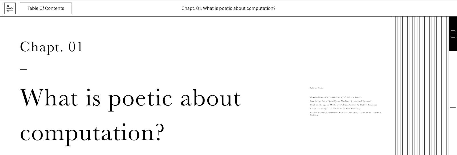
On viewing the first chapter, you immediately see two visual cues that some artistry is afoot. On the right side, you see something that looks like a stack of pages. On the left is some conventional-looking text, and to its right is a some shrunken text. Click on the shrunken text to expand references for the now shrunken main text. This conception of long form text as existing in two streams seems much more elegant than the usual pop-up presentation of references and footnotes in ebook readers. Illustrations appear in both streams, and when you swipe one stream up or down, the other stream moves with it.
The experience of the poetic computation reader on a smartphone adapts to the smaller screen. One or other of the two streams is always off-screen, and little arrows, rather than shrunken images indicate the other's existence.
* * *
On larger screens, something very odd happens when you swipe down a bit. You get to the end of the "page". And then it starts moving the WRONG way, sideways instead of up and down. Keep swiping, and you've advanced the page! The first time this happened, I found it really annoying. But then, it started to make sense. "Pages" in the Poetic Computation Reader are intentional, not random breaks imposed by the size of the readers screen and the selected typeface. The reader gets a sense of achievement, along with an indication of progress.
In retrospect, this is a completely obvious thing to do. In fact, authors have been inserting intentional breaks into books since forever. Typesetters call these breaks "asterisms" after the asterisks that are used to denote them. They look rather stupid in conventional ebooks. Turning asterisms into text-breaking animations is a really good idea. Go forth and implement them, ye ebook-folx!
On a smart phone, Poetic Computation Reader ignores the "page breaks" and omits the page edges. Perhaps a zoom animation and a thickened border would work.
Also, check out the super-slider on the right edge. Try to resist sliding it up and down a couple of times. You can't!
* * *
Another interesting take on the reading experience is provided by Slate, the documentation software written by Robert Lord. On a desktop browser, Slate also presents text in parallel streams. The center stream can be thought of as the main text. On the left is the hierarchical outline (i.e. a table of contents), on the right is example code. I like the way you can scroll either the outline or the text stream and the other stream follows. The outline expands and contracts accordion-style as you scroll, resulting in effortless navigation. But Slate uses a responsive design framework, so on a smartphone, the side streams reconfigure into inline figures or slide-aways.
 |
| "Clojure by Example", generated by Slate. |
There are no "pages" in Slate. Instead, the animated outline is always aware of where you are and indicates your progress. The outline is a small improvement on the static outline produced by documentation generators like Sphinx, but the difference in navigability and usability is huge.
As standardization and corporate hegemony seem to be ossifying digital reading experiences elsewhere, independent experiments and projects like these give me hope that a next generation of ebooks will put some new wind in the sails of our digital reading journey.
Notes:
- The collaborators on the Poetic Computation Reader include Molly Kleiman, Shannon Mattern, Taeyoon Choi and HAWRAF. Also, these footnotes are awkward.


